Applied Intelligence product consolidation
Problem and context:
New Relic’s Applied Intelligence offering consisted of four separate cloud-based SaaS products that represented features and functionality to support the incident response lifecycle. But the disparate, and often duplicative workflows caused confusion to both customers and internal users. Consolidating the four products into one, cohesive product would eliminate some of this confusion, and create an even more powerful way for customers to detect problems in their environment by leveraging core capabilities from each product.
I was tasked with creating vision mockups that would illustrate a singular AI experience that blended the separate products into a cohesive set of workflows.
The New Relic Applied Intelligence offering started with four separate products with duplicate workflows and inconsistent design and interaction.
My approach:
I conducted customer and field sales team interviews that confirmed confusion over the separate products, and helped reveal pain points around troubleshooting workflows that the separate experiences weren’t really helping.
I conducted stakeholder and product owner interviews that underscored business needs for consolidation, as well as helped my understanding of what was necessary from a systems architecture perspective (single notification pipeline, resolving data model discrepancies, dealing with a mix of user roles and entitlements)
Led a small team to collaborate around the information architecture to break the products down into their core capabilities and present a new navigation approach
Designed vision mockups for key screens that would be new to the combined solution
I identified differences in design patterns, workflows and taxonomy across the existing products and worked with a team of 3 other designers to resolve the discrepancies within each separate areas.
Solution mockups:

The most important part of the consolidation project was to identify an information architecture that encompassed all of the capabilities of the original products, but made sense as a holistic product.
The metaphor that rose to the top loosely followed the incident response user journey, was task-focused, and provided very logical sets of capabilities that resonated with both stakeholders and customers.
Some stakeholders were initially resistant to removing the original product names, but eventually came to embrace the verb + noun structure that emphasized tasks and their objects.
Vision mockup for the consolidated AI experience
Value delivered:
Provided solution mockups for the revised information architecture and combined experience that helped stakeholders and team rally around the possibilities of a combined experience
Created detailed audit for each of the separate products to identify areas of design or taxonomy inconsistency that became backlog the separate teams could tackle

Mux.com pricing page improvements
Problem and context:
Conversion numbers were low for Mux.com’s pricing page. Anecdotal feedback from sales indicated that some visitors found our pricing confusing, and didn’t know what plan was appropriate. I was asked to provide some rapid improvements that could be experimented on that would drive up interaction for signups and sales outreach, which would hopefully increase conversion.
Key challenges:
Stakeholder alignment: Historically, the pricing page was notoriously challenging to get stakeholders to agree on messaging and how to move forward.
Setting expectations around “experimentation”: At the onset of this effort, the project sponsors expected that we would A/B test multiple pricing page designs, see results, and pick which one was the most successful. I had to set expectations that in the short amount of time we had, and the number of visitors, it would be nearly impossible to identify what actually “moved the needle,” not to mention the development time and costs that would be involved. Instead, I suggested we address a small set of prioritized problems 2 week cycles, measure with clear goals in mind, and iterate.
Approach:
Even though I had limited time to do any kind of research or data-gathering, I chose to do a quick scan of competitive and other SaaS pricing pages, in order to quickly get a sense of what worked well and what didn’t.
Because I couldn’t actually know which pages were successful, I developed some evaluation criteria:
If there are multiple plans offered, including a free trial, is it clear what’s included in each?
Are visitors able to get a general sense of what their total costs would be for their anticipated level of usage, including any optional add-ons?
Are there clear calls to action to get started and/or contact sales? Are any terms that might be unfamiliar explained?
Does the pricing page convey product value using content that appeals to both end users and decision makers?
Is the page designed in such a way that it’s not overwhelmingly dense with information, but uses design techniques such as progressive disclosure to optionally reveal more information?
Competitive scan of pricing pages
At the same time, I did a series of internal interviews with sales, marketing and other stakeholders to really get at who we wanted the pricing page to speak to, and how we could better convey the value proposition of Mux.
I also worked with our analytics team to get baseline metrics for interaction that we could review weekly as we began experimentation. We decided to remain focused on the most important metrics: signups (what we referred to as self-service customers) and sales contacts.
This led to being able to quickly identify problems and solutions, which I then worked with stakeholders to prioritize.
How my solution addressed the problem:
The competitive scan helped emphasize what the pricing page was missing. Mux’s pricing page lacked clear delineation of what was included in each plan, and value and benefit statements that would appeal to decision-makers, not just developers. Having clear evidence to point to was huge in getting quick stakeholder alignment.
Stakeholder interviews helped prioritize the problems we wanted to solve. In lieu of actual conversations with customers or visitors, this helped reveal some problems with the page that we could improve. Thankfully those aligned nicely with the findings from the competitive scan.
Solution mockups:
Before and after of the pricing page
Value delivered:
Provided a set of prioritized problems and solutions for pricing page experimentation in 2 week sprints, along with measurable goals, that all stakeholders were fully aligned on.
Updated design that addressed the prioritized problems to solve
McAfee Endpoint Upgrade Assistant
Problem and context:
One of the biggest problems plaguing McAfee's Endpoint Security product was just how difficult it was to upgrade from older versions of legacy software. Even the simplest upgrades required checking for compatibility to ensure minimum “upgradable” versions were present in the environment. The more complex upgrades had multiple dependencies and often required “ripping and replacing” products on systems.
Key challenges:
IT administrators with complex environments were dealing with a mix of PCs in different states, and every installation required IT administrators to do manual work to mitigate dependencies incompatibilities, and identify when systems were in a ready state to upgrade.
Solution:
Working closely with engineering to understand the technical workflow, I lead the design for the tool called the Endpoint Upgrade Assistant. This guided users through the process of preparing their environments for upgrades, and could complete batch actions.
I divided the workflow into multiple steps: Overview, Prepare, Upgrade and Track, and utilized color coding to identify the state of each batch of systems in the environment.
After testing using a clickable prototype I developed in Axure, the team moved forward and built the tool. I worked on this product on an ongoing basis over a year and a half, and made multiple iterative improvements based on end user feedback.
Value delivered:
Provided IT administrators with a simple interface to manage a large number of PCs and ensure they have the latest McAfee enterprise software
Created an interactive Axure prototype that allowed for quick user feedback cycles without relying on development to code

Mux’s Billing Portal
A complete redesign for Mux’s customer-facing billing experience that addressed multiple customer and stakeholder pain points.
Problem and context:
Mux’s billing page had not been updated since the launch of the company 5 years ago, and needed to evolve to support new products and more complex plans. Very little detail was shown for usage, which made it difficult for customers to understand what their bill would be. The page needed a complete overhaul to provide more real estate for enhanced usage detail, new products and plans.
Mux’s previous billing page
Key challenges:
Mux had multiple possible plan configurations, including custom plans for enterprise and volume customers, that all looked fairly different. My design had to be flexible to support all of these scenarios in a consistent way, but without introducing a lot of complex logic to display different versions of the page.
Approach:
I conducted a thorough discovery phase with internal stakeholder and customer interviews that provided a clear sense of pain points and limitations with the current billing page.
How my solution addressed the problem:
Visibility into their next bill: One of the biggest customer pain points I uncovered was not knowing how their usage would affect their next bill. This was a challenge for both our self-service customers and contract customers, who paid a fixed amount for a set of minutes each month. I learned we had estimated usage data easily available on our internal administration database, and we could easily provide an estimate of their usage, so I incorporated that into the customer-facing billing page.
Usage visualizations: Incorporating usage bars helped contract customers understand how much of their monthly contracted amount they had left.
Revised IA with room to grow: I expanded billing from a single page into a billing and usage portal with 4 different sections: the current billing summary, payment information, invoices and plans. This provided some much-needed real estate for detailed usage information and plan details without cramming everything onto a single page with excessive use of modals.
Dedicated page for new users to sign up: I designed an updated full-screen page for customers visiting the billing section who hadn’t yet signed up. This gave us plenty of real estate to showcase the plans available.
Extensible design: Working closely with engineering, I developed a design that would be extensible to support both self-service and contract customers with different plan types. I provided multiple mock-ups in Figma to show how the page would look for different plan permutations using actual billing data.
Driving traffic to the new page: To entice customers to visit the new page once it was delivered, I authored a blog post that showcased the redesigned billing experience and new features.
Solution mockups:
New billing summary page for PAYG (pay as you go) customers
New billing summary page for contract customers that includes usage bars
Expandable rows helped accommodate complex pricing structures like tiered resolution-based pricing in a consistent way
Updated plans page for new customers
Value delivered:
Reduced customer support inquiries for frequently-asked billing and usage questions on usage and invoices
Created efficiencies for engineering by designing a flexible, extensible design that easily supported new products and changes to pricing (for example, we recently added tiered pricing and resolution-based pricing) without having to drastically update the designs
Complete set of designs for multiple permutations of the billing page with different plan configurations that continues to serve as a reference
Increased usage of the billing pages over time

Roles and access discovery research
A large research effort to uncover challenges and limitations with user roles and account structure.
Problem and context:
The roles available for Mux users have traditionally been binary: Administrator or non-administrator. Multiple product requests had been made around the ability to provide more granular roles, control who sees what content, limit some users to certain features, or provide read-only access. Additionally, Mux’s account structure does not meet the needs of some customers with more complex use cases. While that was not the initial focus of the research effort, we planned to learn as much as possible in that area as it’s closely related to access.
Key challenges:
Managing the scope of the research. Internal interviews revealed multiple use cases that I wanted to go deep into, but the scope had to be managed tightly due to timing.
Framing the research appropriately with stakeholders. Due to the limited number of users I would be speaking with, I needed to carefully set expectations with stakeholders. The approach I planned to take would be to go deep into some specific use cases, as opposed to a more broad generative research study.
Research plan and structure:
After conducting internal interviews with 12 Mux colleagues across different teams, most of whom worked directly with customers, we were able to identify 5 key areas where we wanted to learn:
How well are Mux’s current roles working for customers? Do they need more or different roles?
Are there features where our customers want to restrict or control access?
Are there content or assets in Mux that customers want to have control over who can access it?
What are some of the unique needs of customers who use Mux with their own customers?
What other access-related concerns are important, such as auditing and provisioning?
These areas of focus helped me identify which external customers to talk to around each specific use case. Working closely with our sales and customer success teams, I reached out to customers who had made specific feature requests or provided feedback in the area of RBAC. Thankfully, most of these customers were more than willing to have a dedicated session to go into their use case in detail. I kept interviews short and focused at 30 minutes, which really helped in recruiting.
I structured the discussion guide to align to the 5 key areas above so it would be easy to both go very deep into their use case, but also gather general information.
Synthesis and findings:
Example synthesis canvas in Dovetail
I tagged all interviews in Dovetail, and synthesized the output of each conversation around the 5 key areas above. Dovetail also offers other ways to slice the data, so I also looked at each area in terms of customer size (enterprise, mid-market, or startup) and customer archetype. This identified a few trends, and helped later on with prioritization of the opportunities we uncovered.
Synthesis revealed the following findings:
Mux customers want to protect their video content and metrics by controlling who can access it, for a variety of reasons. Fear of accidental deletion, the security principle of least privilege, and proprietary data were the reasons most commonly cited.
Mux customers struggle to scale the product with their business. They are unable to structure their content and data in a way that aligns with their business, which has prevented them from adding additional users.
Those problems get worse for customers with their own customers, and they often resort to unideal workarounds. These types of customers wanted to keep their client’s assets and data completely separate, and also view their customer’s billing and usage data separately. This problem has led some of them to create multiple separate accounts with Mux to protect their assets.
Roles needed to evolve, but need to remain simple to provision. Some new persona-based roles were suggested (e.g. a developer role, billing admin, etc.), but these were generally considered nice to haves, and most wanted to keep things simple. Many used the example of how complex a product like AWS was to provision and maintain.
Immediate improvements could be made by improving documentation on roles and access. This was the most notable finding at all to me – customers didn’t understand how our current system worked, and had many misconceptions.
Findings slides from stakeholder presentation
Value delivered by this work:
Provided much-needed color to key use cases around RBAC that helped define a multi-year roadmap
Helped identify and prioritize an MVP solution that would allow customers to manage access to specific sets of assets by development environment or by digital property
Strengthened relationships with customers (who I plan to reach out to for design feedback in subsequent RBAC projects)
My contributions:
Solo execution of full discovery project
Developed research plan and discussion guide
Conducted internal and customer interviews
Synthesis of findings and recommendations
Stakeholder presentation
Anomaly detection: The evolution of an experience over 3 years
An interactive notification experience in Slack to help DevOps engineers troubleshoot faster.
Problem and context:
When I joined the team at New Relic that focused on AI and machine learning, the team was in the middle of re-chartering. The team had built a way to automatically detect anomalies in complex environments, based on what is commonly known as the golden signals – focusing on errors, response time, and throughput.
My task was to figure out how to deliver the experience for these anomalies to New Relic users. These anomalies would ideally assist them in troubleshooting various issues in their tech stack. From a business perspective, this was seen as an added value for New Relic’s regular customers.
I had to make sure I fully understood the problem I was trying to solve. While the engineering team focused on the underlying detection algorithms, I spent some time rapidly understanding the users and problem space. Through a lot of reading and conversations, I quickly developed a straw-person of a user journey for troubleshooting.
As a team, we decided to focus on a single part of the journey, the why:

I developed this problem statement to frame our work:
“How might we help incident responders understand and troubleshoot problems faster in complex environments?”
Delivering anomalies in multiple contexts
Anomalies with alert notifications:
Our first effort was to deliver detected anomalies along side existing alert notifications that would provide more context about the problem.
One of the design challenges I faced was figuring out how much attention to give to the anomaly vs the alert notification. I did a lot of iterations.
What we first delivered was a banner that would appear in context with an alert, on the alert details page. The copy became very important – we couldn’t definitively say that the anomaly was part of the root cause of why the alert had triggered, but rather that it was additional context and something worthy of investigation.
Anomalies in the New Relic mobile App:
Soon after building the desktop software experience, we wanted to deliver the experience in the New Relic mobile app. Mobile is one of the primary touchpoints for alert responders, as they’re often on call and not always in front of their laptop.
Anomalies in Slack:
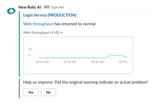
The next most important touchpoint was Slack, where most New Relic users already received alert notifications.
Designing this experience in Slack became the most uniquely challenging aspect of this project. Slack is limited in terms of what visual elements can be included, and requires the use of its very specific design components, but there was so much potential in meeting users where they already were, and deliver them vital information that they could then take action on.
Anomaly detection outside of alert notifications
Our analytics showed a high amount of interaction with anomalies in Slack, and leadership saw a lot of promise in delivering a quick way to detect problems automatically without creating complex alert thresholds.
Delivering anomalies “automatically,” and independent of alert notifications in Slack, required a configuration experience within the New Relic product. This would allow users to configure what types of anomalies were delivered, and to where (Slack channel or webhooks).
My team had a lot of concerns we’d be overwhelming users with too many notifications. To mitigate this, I designed some carefully scripted interactivity that allowed users to mute or turn off notifications. In an ideal world, we’d allow users to provide more direct feedback on the detections that would influence the algorithms . That work was on the horizon, but it turned out it was a pretty challenging engineering problem to solve.
Getting user feedback:
When we started working on getting user feedback for anomalies, it was with the desktop experience. I iterated on how best to do this in both the desktop application and in Slack. I created an A/B test in the desktop application to identify the best way to gather feedback.
Once our focus had shifted to delivering anomalies in Slack, the ability to provide feedback became the biggest requested feature from customers. It was challenging for me to figure out exactly what to ask users to get the right feedback. Often, an anomaly would occur that was expected (for example, throughput increasing during health checks that would run at regular intervals). What we were detecting wasn’t wrong, but users didn’t necessarily want to be notified every time.
I worked with my team of ML engineers to figure out how to ask the right question with a few different possible responses:
It turned out to be incredibly difficult for the application to actually adjust the anomalies detected over time. As it turns out, machine learning is hard. So for the time being, we used the feedback to “gather information.”
Research revealed that we HAD to solve the feedback problem.
Shortly after we launched the feedback feature, I conducted a pretty big research study on the end-to-end anomaly detection experience. Almost all users expected that providing feedback would actually change their detections, a completely reasonable expectation. The engineering team was still working on this feedback problem when I left the organization.
There was a lot of promise in the ability to get more context for anomalies. As part of this research study, I showed some customers an early mockup of a new experience my team was exploring – the ability to “analyze” an anomaly and get more context and information.
Users could click from Slack that would open this view to get more details about the anomaly that was identified:
A shift in strategy:
Our team’s focus shifted to developing this new experience, and I refined the designs to focus on questions from the troubleshooting journey:
Has anything else been detected?
What’s unique about this problem?
Where should I start troubleshooting?
What other metrics might be affected?
What’s not being affected?
What’s happening upstream and downstream of this application?
I refined the design further. We built it, released it, and I added a microsurvey using Sprig to evaluate the effectiveness of both the analysis and the design. This also helped with recruiting customers to talk to for continuous discovery – users could indicate in the microsurvey if they’d be willing to talk to a member of the product team.
Value delivered:
Created a culture within the team of continuous discovery and customer feedback that helped us evolve and improve the experience over time.
Rapid storyboard iteration that helped the team make design decisions quickly
Worked with Slack’s Block Kit Builder to quickly prototype what our Slack experience would look like
Gathered customer feedback that helped drive the strategic focus of the product
My contributions:
Lead/solo designer responsible for end-to-end product and interaction design
Planned and executed generative and evaluative research
Contributed to product strategy, working closely with PM

Intel Widi (wireless display)
Overhauling an overdesigned hardware and software experience down to its simplest functions.
Problem and context:
As part of Intel’s “no wires” offering to drive enterprise PC sales, Intel Pro WiDi (wireless display) was a hardware and software application that allowed multiple meeting participants in a conference room to connect and share to a display wirelessly. This software would ship with every Windows PC that had an Intel processor capable of wireless display.
When I joined Intel to lead the design effort for this team, an early version of the solution existed, and the team had just brought the application into formal usability testing by means of a 3-month longitudinal study.
Unfortunately, it performed quite poorly. I was tasked with fixing the application.
Results revealed that it was difficult for participants to accomplish basic tasks, and the app was full of features that didn’t add much value.
There were too many steps involved in connecting and sharing
Selecting “meeting modes” was awkward, overly complex and went against the natural flow of meetings
In-application messaging was cumbersome and not useful when people were in the same room
Disconnection was not easy or obvious
Using the term “meeting” in the application caused confusion with software like Webex, Lync or GoToMeeting (this was pre-Zoom) where participants expected similar functionality
The previous WiDi (Wireless Display) application
Key challenges:
The application needed to be radically simplified, but business stakeholders were resistant to removing existing functionality.
The business required both the software and hardware to be backwards compatible with multiple versions of Windows. Firmware changes weren’t possible in the older hardware, which resulted in a less than ideal user experience.
How my solution proposed to address the problems:
Simplified meeting modes to support natural human interaction, including making the default mode open and unrestricted. Also introduced a simple “Block others from presenting” as a simple checkbox control.
Removed in-app messaging and communication
Introduced new “Ready to Present” screen that separated connection from sharing for privacy and security
Made disconnection more obvious
Sharing functionality (Duplicate or Extend Screen) becomes the primary interaction on the screen
Removed meeting terminology that caused confusion
We brought it in for another round of usability testing:
Using a clickable prototype, we had participants run through 3 meeting scenarios with the application screens. Findings were better than the previous test, but there were still issues.
Round 2 of usability testing using a clickable prototype
The findings were better.
Meeting & projection modes were much clearer to participants compared to the previous study
Concerns emerged around participants spending too much time “fiddling with the UI” instead of focusing on the meeting
Ensuring a smooth transition to the next presenter was much more important than the idea of “moderated mode.”
All participants still expected Pro WiDi to support remote attendees in spite of the UI and definition
But it was clear that we needed to simplify further. I had encouraged our stakeholders to attend the testing sessions so they could observe participants using the application. This helped underscore the need to simplify the application where there was some previous resistance to change.
So I broke the application down to its core functions, and started over.
Breaking down the application to its basic functionality to define an MVP
I focused on the following improvements:
Drastically reduced the UI so participants can present their content more quickly
Simplified meeting modes even further and pushed the functionality into a tab. This was a reasonable compromise that addressed the reluctance from stakeholders to remove functionality from the application.
Created a simplified experience for extended presentation mode that worked better with the latest versions of Windows
A radically simpler UI that reduced the number of clicks and used progressive disclosure to reveal non-core application functionality
Round 3 of usability testing with the full hardware and software solution, with the redesigned application, was much more successful.
Value delivered:
Drastically simplified the application down to an MVP that performed well in usability testing, and reduced unnecessary functionality
Invited stakeholders to attend user testing to observe participants interacting with the tool, which helped convince them to simplify the application
Began conversations with Microsoft to embed the functionality of allowing multiple presenters to connect into Windows 10.
My contributions:
Lead UX designer responsible for conceptual design
Oversight of interaction design
planning and executing user research